


Solid Starts
Design System
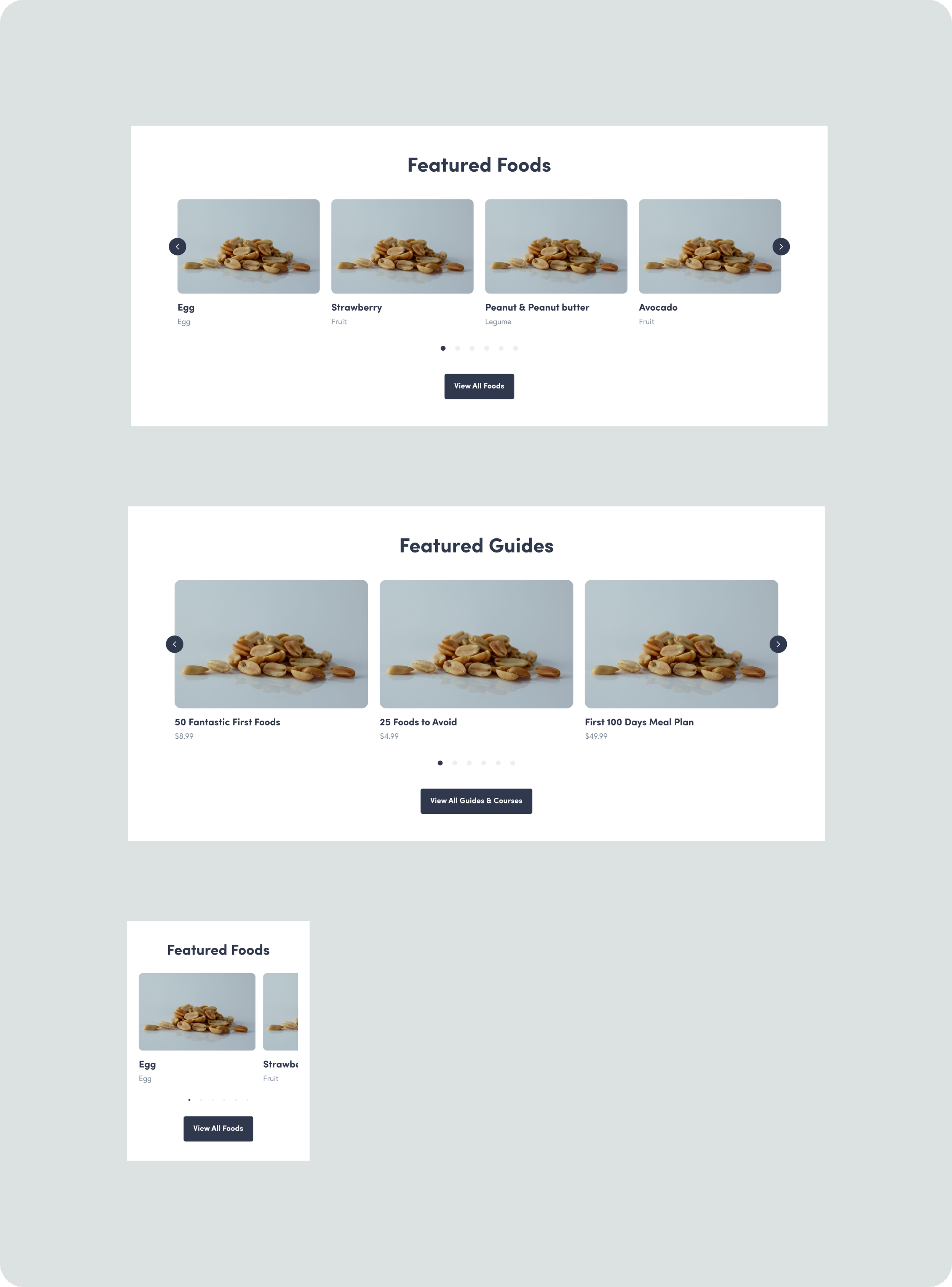
Development of a custom design system for “Solid Starts”, award-winning first foods database platform for parents around the globe. The work consisted on streamlining their digital presence and enhancing brand consistency. By implementing cohesive UI components, the efficiency was improved across teams, reducing design and development time, and delivering a seamless user experience, strengthening their overall brand identity.


PRE-DESIGN SYSTEM
01 Research & Planning
Before starting any work, it was essential to evaluate the brand's current state and identify key areas for improvement, highlighting the reasons behind these focus areas and the desired outcomes.
-
Why having a design system?
How will the design system align with the business strategy?
Who will be the users of the design system (e.g., designers, developers?)
Do we want to build a public or internal design system?
What are the goals and objectives of the design system?
-
How do you handle suggestions from other teams?
Who and how can contribute to the design system?
What will be the process for updating design components?
When the system gets updated, where do people get notified? Who communicates all the changes?
What educational materials can we create to quickly onboard new people and upgrade their knowledge?
-
What kind of naming conventions are we using?
How can we ensure our design system is scalable?
How do you collect feedback to make your design system better?
What's the plan for getting rid of outdated design elements?
Is detaching allowed? How can we get the updated (or new suggestions) back into the design system?
-
Which web tools we will use?
Which Figma plugins can we use?
Define dependencies.
-
Do we have brand guidelines
How will we handle content localization or internationalization?
What are our SEO (Search Engine Optimization) considerations for content?
VISUAL FUNDATIONS
02 Core UI
Grid system
The grid system provided a structured layout ensuring consistency and alignment across all screens. It helped maintaining a responsive design, adapting seamlessly to different device sizes.
Color palette
The color palette featured a core theme, along with semantic colors that were aligned with and connected to the core scheme.
Typography styles
Typography styles covered font choices, sizes, and weights. These styles helped maintaining hierarchy and readability across different devices and platforms.
Iconography
The iconography system included a collection of icons clear, scalable, and aligned with the brand’s visual language.
UI elements
UI elements included buttons, input fields, sliders, checkboxes etc

VALIDATION
03 Accesibility
Ensuring accessibility & inclusivity in a design system for a website is crucial for creating a product that is usable by all people, including those with disabilities. It involves implementing standards and best practices that promote equal access to information and functionality


METHODOLOGY
04 Atomic Design
The methodology used was “Atomic design” based on breaking down the interface into hierarchical components, helping to build consistent, scalable designs.

-

✺ ATOMS
Basic UI elements like buttons, input fields, and checkboxes.
-

✺ MOLECULES
Combinations of atoms, such as a form input group (label + input + error message).
-

✺ ORGANISMS
More complex UI components, which may combine multiple molecules.
-

✺ TEMPLATES
Final layouts that combine organisms and components to create full-page designs.
BUILDING BLOCKS
05 Components
The components were created as reusable building blocks forming the core of the design system. These components were designed to be modular, scalable, and consistent across the entire interface, ensuring efficiency in both design and development. Each component is purposefully created to be flexible and adaptable, enhancing the user experience while maintaining the brand's visual identity.
PROCESS
06 Maintenance
In order to maintaining the design system some rules were stablished to ensure it remained efficient, scalable, and aligned with evolving brand and user needs.
-

✺ CLEAR DOCUMENTATION
This included usage instructions, design specifications, and code snippets to enable easy reference and consistency across teams.
-

✺ VERSION CONTROL
Tracking of changes and updates to components, styles, and guidelines. This would help reverting to previous versions if needed.
-

✺ AUDIT COMPONENTS
Regular reviews of components to assess relevance, quality, and performance.
-

✺ GOVERNANCE MODEL
Roles and responsibilities for maintaining the design system, including who can propose changes, how approvals work, and the process for implementing updates.